London transport’s first chief executive may have died more than 75 years ago, but Frank Pick’s philosophy on form and function is very much in evidence both below and above ground all around the capital
Frank Pick is a legendary figure in the history of London’s transport in the 1930s, commissioning famous designs, including many of the Underground’s Art Deco stations, the Johnston typeface and the world-famous roundel, the last of which is featured in another of our posts, The roundel: a design for all times.
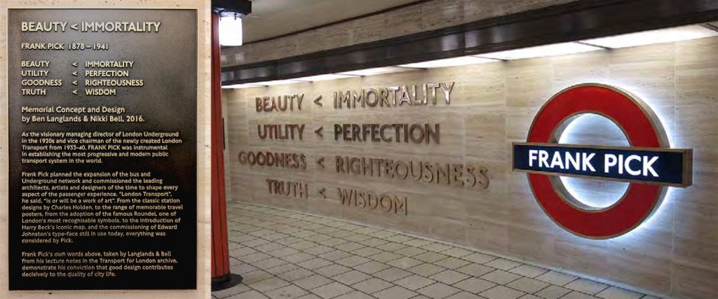
He was London Transport’s first chief executive, who is now commemorated in an artwork at Piccadilly Circus Underground station, which was unveiled in 2016 to mark the 75th anniversary of his death (pictured below).
Designed by Turner Prize-nominated and BAFTA award-winning artists Langlands & Bell, the artwork is called Beauty < Immortality, and was commissioned by the London Transport Museum and London Underground’s Art on the Underground programme.
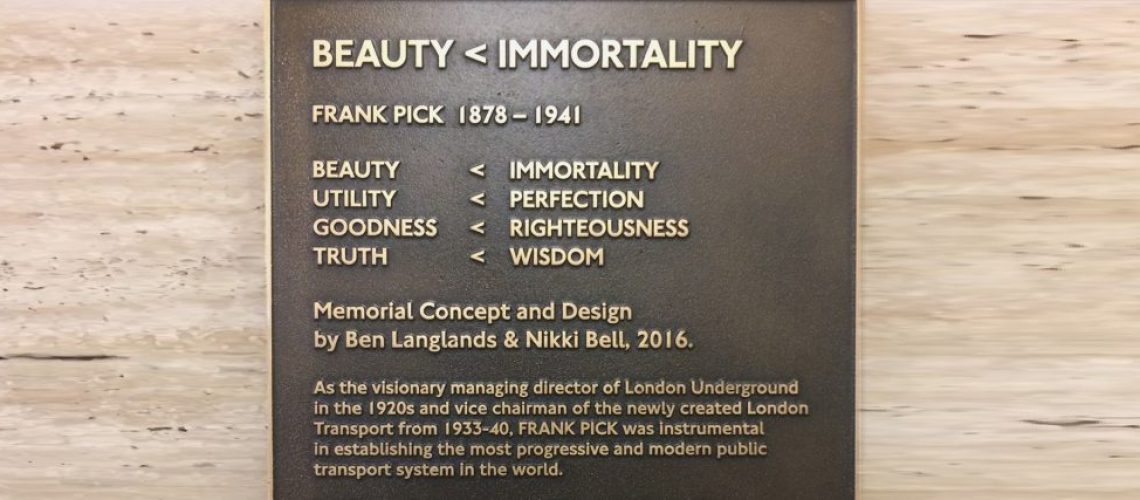
The work’s title was the result of a discovery among jottings made by Pick. The text featured in the memorial reads: ‘Beauty < Immortality Utility < Perfection Goodness < Righteousness Truth < Wisdom’, which, according to the London Transport Museum, symbolises Pick’s view that ‘the quality of our surroundings contributes to our own quality of life’.
Designer Ben Langlands said: ‘The museum has a substantial archive at a depot in Acton, so we kind of immersed ourselves in the whole thing. ‘When we looked through Pick’s lecture notes we didn’t know if we’d find anything, but then we just stumbled on this little equation and we felt that it was the key to his thinking. It was a lightbulb moment.’

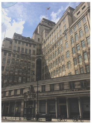
Piccadilly Circus station is the perfect place for the memorial, for this was one of the commissions Pick gave to architect Charles Holden, with whom he had a long collaboration. As well as remodelling Piccadilly Circus, Holden designed the new headquarters for the then London Underground Electric Railways Company, forerunner of today’s Transport for London.
Dubbed London’s first skyscraper, the cruciform design of 55 Broadway includes relief sculptures at level six on each side of the building representing the four winds – East, West, North and South – by sculptors including Eric Gill and Henry Moore, and two further sculptures above ground floor level – Night and Day – by Jacob Epstein. Some of these can be made on the photo on the right.
As already mentioned, Pick commissioned Holden to design a series of stations, among which were Arnos Grove, Southgate and Gant’s Hill – all very much in use today and fine examples of the modernist architecture favoured by Pick, which gave Underground stations a distinctive, easily recognisable look.
But architecture is not the only sphere in which Pick made excellent choices. He had previously overseen a successful advertising campaign to promote travel by Underground, which included a series of posters enticing Londoners to take the Tube to the countryside or to visit the city’s many tourist sights. Many of these posters are on show at the London Transport Museum.
Last but not least, we must not forget the hallmark roundel, which started out as a solid red “bullseye” and evolved into the donut design bisected by a banner incorporating the station name in Johnston’s typeface (yet another Pick commission), a version of which we continue to see all over London today.
See also:
The roundel: a design for all times
Read about Frank Pick and his work on the London Transport Museum website


