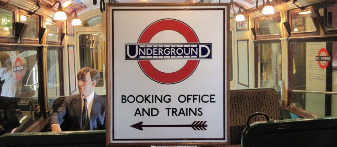
It is a symbol of London that even those who have never boarded a London Underground train or London bus will almost certainly recognise
The roundel was only meant to inform Underground passengers which station they were at, but it has become a world-famous symbol of London.
Originally known as the bullseye, it was first installed at St James’s Park station in 1908. Since then, it has undergone a design evolution and has been modified to identify other forms of transport running in London.
It was one of the many design innovation introduced in the 1930s by Frank Pick, the first chief executive of London Transport. He was also responsible for introducing Harry Beck’s diagrammatic representation of the London Underground network, which has been copied worldwide, the use of the Johnston typeface to standardise signage and Charles Holden’s modernist Tube station buildings.
The roundel has also influenced transport design in other countries – thanks to London Underground acting as a consultant to many world metro systems. By the 1930s similar symbols were adopted for systems in France and Spain, and by the 1950s for systems in New Zealand, Cuba and the Indian subcontinent.
It has even inspired the logo of a British-style fish and chip restaurant in New York City – it is called A Salt & Battery.
Design historian David Lawrence, who wrote a book about the roundel some years ago, said: “It would be nice to think the average Londoner has a sense that this single symbol has come to be one of the most pure and unique symbols representing a city, and a citizenry, anywhere in the world – thus it is the heritage and the culture of every Londoner.”
Read about Frank Pick and his work on the London Transport Museum website

